Master the art of composition in cinematography. Learn essential techniques, from Rule of Thirds to advanced tactics, to elevate your visual storytelling and create compelling shots.

You know that feeling when you’re watching a film, and a particular shot just grabs you? It’s not just about what’s being shown—it’s about how it’s being shown. That’s the magic of shot composition in cinematography. As a cinematographer, your choices in framing can make or break the visual storytelling of your film. It’s about more than just following rules; it’s about knowing when to break them, how to guide your audience’s eyes, and most importantly, how to evoke the right emotions.
In this guide, I’ll share some key principles of shot composition that every filmmaker should know. I’ll also sprinkle in some personal insights and experiences from my time on set, where the right shot composition can transform a good scene into an unforgettable one.
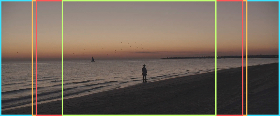
Let’s kick things off with balance, one of the foundational principles of shot composition. Imagine you’re setting up a shot, and everything within the frame just clicks together—you’ve got a visual harmony that’s satisfying to the eye. That’s balance at work. But here’s the kicker: balance doesn’t always mean symmetry.
Visual Harmony: When you balance a shot, you’re distributing visual weight evenly across the frame. This could mean centering your subject or positioning elements in a way that they counterbalance each other. A well-balanced shot naturally guides the viewer’s eyes, making sure nothing feels out of place or jarring—unless that’s exactly what you’re going for.
Intentional Imbalance: Sometimes, though, you might want to disrupt that harmony. Think of it like adding a dash of spice to a dish—it shakes things up. An unbalanced shot can inject tension, highlight a particular element, or even prepare the audience for something unexpected. This technique works wonders in scenes where you want to keep the viewer on their toes.
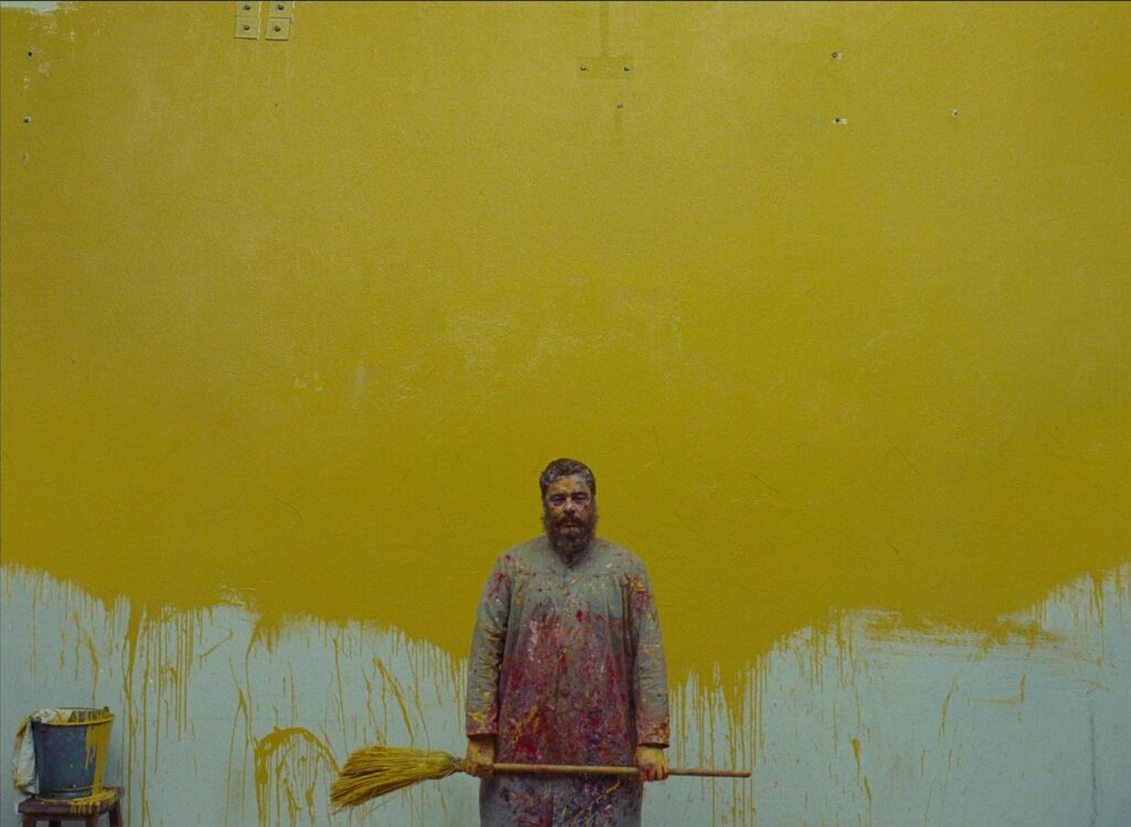
If you’ve ever watched a Wes Anderson film, you’ve seen symmetry in action. Anderson’s frames are meticulously balanced, creating a sense of order and often, a quirky, almost storybook feel. Symmetry is visually satisfying because our brains love order. But let’s not forget asymmetry—where the real dynamism happens.
Symmetry in Practice: Symmetrical shots feel organized, calm, and often, they’re strikingly beautiful. They’re perfect for scenes where you want to emphasize stability, perfection, or a sense of balance in the character’s world.
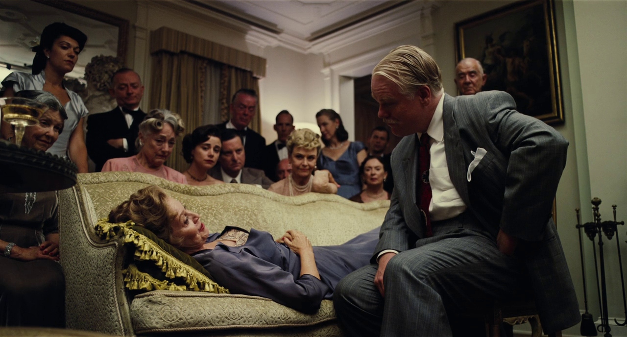
Asymmetry for Dynamism: Asymmetry, on the other hand, introduces movement and tension into your frame. By placing your subject off-center or by having elements that aren’t evenly distributed, you create a visual imbalance that draws the viewer’s eye across the frame. This technique is fantastic for building suspense or showcasing a character’s inner turmoil.
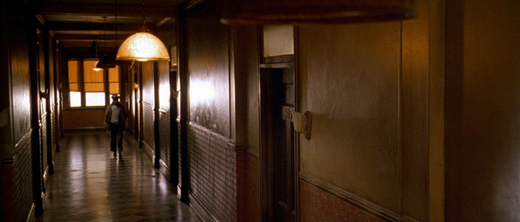
Film is a two-dimensional medium, but the magic of cinematography lies in making the audience forget that. This is where depth and leading lines come into play.
Creating Depth: Depth in a shot is all about making your audience feel the space. You can achieve this through the positioning of your subjects, the use of foreground, middle ground, and background elements, and by playing with lighting. For instance, placing objects at varying distances from the camera can add layers to your composition, making it feel more lifelike and immersive.
Guiding the Eye with Leading Lines: Leading lines are a cinematographer’s best friend. These are lines within the frame—be it a road, a railing, or even a character’s line of sight—that guide the viewer’s eye towards the focal point of the shot. They’re subtle but powerful, pulling the audience into the story and making sure they’re looking exactly where you want them to.
Let’s talk glass. Your lens choice can drastically alter the composition of your shot. Wide-angle lenses and telephoto lenses are not just about getting more or less in the frame—they shape the way your audience perceives the space and the subjects within it.
Wide-Angle Lenses: These lenses exaggerate the distance between objects, making spaces look larger and subjects farther apart. They’re perfect for establishing shots or when you want to give a sense of grandeur or isolation.
Telephoto Lenses: On the flip side, telephoto lenses compress the space, bringing background and foreground closer together. This can create a more intimate feel, or conversely, make a crowded scene feel claustrophobic. It’s all about how you want to manipulate the space within the frame.
Depth of Field: Your lens choice also affects depth of field—the range of your shot that’s in sharp focus. A shallow depth of field (achieved with a longer lens) can isolate your subject from the background, drawing the viewer’s eye directly to them. Meanwhile, a deep focus (achieved with a wide-angle lens) keeps the whole scene in focus, allowing the audience to take in all the details.
Now, let’s get into some classic composition rules, starting with the Rule of Thirds. This is probably one of the first things you learn as a cinematographer, and for good reason—it’s a simple yet effective way to create balanced and engaging compositions.
The Basics: Imagine your frame divided into nine equal parts by two horizontal and two vertical lines. The idea is to place your subject along these lines or at their intersections. This naturally draws the viewer’s eye and gives your composition a pleasing balance without feeling too static.
Breaking the Rule: But remember, rules are made to be broken. Once you’ve mastered the Rule of Thirds, experiment with centering your subject or pushing them to the edge of the frame. You might find that breaking the rule adds more power to your shot, especially when you want to create discomfort or emphasize a particular narrative point.
Image Suggestion: An overlay of the Rule of Thirds grid on a well-composed shot, showing how the subject aligns with the intersections.
Head room is all about the vertical space between your subject’s head and the top of the frame. It’s a small detail, but it makes a big difference in how your shot feels.
Getting it Right: Typically, you want your subject’s eyes to fall around the top third of the frame. This creates a comfortable amount of space above their head without making them look too cramped or too distant.
Creative Head Room: But sometimes, breaking this rule can add a whole new layer of meaning to your shot. For instance, giving a character too much head room might make them seem small or insignificant within the frame, which could be exactly what you’re going for in a particular scene.
Image Suggestion: Examples of different uses of head room—standard, excessive, and minimal—to show how each affects the mood of the shot.
Leading room, also known as nose room or look space, refers to the space in front of a subject’s gaze or direction of movement. It’s essential for maintaining visual flow and giving your composition a sense of direction.
Creating Flow: By leaving more space in front of your subject, you allow the viewer to anticipate where they’re headed, whether it’s literally or figuratively. This creates a natural flow within the frame, making your shots feel more dynamic.
Pushing Boundaries: On the other hand, cramping your subject with little or no leading room can make the viewer feel uneasy, which is a great tool for building tension or showing that something is off.
Image Suggestion: A scene with generous leading room contrasted with one where the leading room is minimal, highlighting the different emotional impacts.
The Golden Ratio, also known as the Divine Proportion, is like the Rule of Thirds on steroids. It’s a more complex guideline that has been used in art and architecture for centuries to create compositions that are naturally pleasing to the eye.
Applying the Ratio: You can overlay a Golden Spiral (derived from the Golden Ratio) onto your frame and place key elements along its curve. This can create a more organic flow in your composition compared to the Rule of Thirds, which can sometimes feel too rigid.
Practical Tips: While the Golden Ratio is more of an advanced technique, don’t shy away from experimenting with it. You might find it gives your compositions a unique sense of balance and flow that’s hard to achieve with more straightforward methods.
Image Suggestion: A frame with the Golden Spiral overlaid, showing how elements in the shot align with the curve.
Every element in your frame has visual weight—whether it’s a character, a prop, or even an empty space. Understanding how to balance visual weight can take your compositions to the next level.
Balancing Act: Larger, brighter, or more colorful objects naturally carry more visual weight. By carefully arranging these elements, you can create a balanced composition that feels stable and intentional. But don’t forget—unbalancing the visual weight can be just as effective for creating tension or emphasizing a particular part of the frame.
Playing with Contrast: Contrast is a powerful way to manipulate visual weight. For instance, a bright object in a dark scene will naturally draw the viewer’s attention first. Use this to your advantage to highlight important elements and guide your audience’s eyes where you want them to go.
Image Suggestion: A shot demonstrating the use of visual weight, with annotations pointing out how different elements contribute to the overall balance.
Composition isn’t just about static frames. Camera movement adds another layer of complexity and can transform a simple shot into something dynamic and engaging.
Moving with Purpose: When planning a camera move, think about how it will change the composition over time. A slow push-in might gradually reveal details, while a quick whip pan could disorient the viewer. Each movement alters the frame’s composition and, when done right, enhances the storytelling.
Integrating Movement: One of my favorite tricks is to start with a composition that feels off, then correct it through movement. This technique can be incredibly effective in action scenes or moments of emotional climax, where the camera’s movement mirrors the internal journey of the characters.
Image Suggestion: A storyboard sequence showing how camera movement changes the composition from one frame to the next, emphasizing how motion can shift visual focus.
So, there you have it—shot composition in all its nuanced glory. We’ve covered the essentials, explored advanced techniques, and even talked about when it’s okay to break the rules. But remember, these are just guidelines. The real art of cinematography lies in knowing when to throw the rulebook out the window and follow your instincts.
Whether you’re framing a quiet, introspective moment or an explosive action sequence, your composition choices will shape how your audience experiences the story. So go ahead—experiment, push boundaries, and most importantly, have fun with it. After all, filmmaking is as much about creativity as it is about technique.
Practice, practice, practice. Get out there with your camera and start framing shots. Watch films critically—pause and analyze how scenes are composed. Experiment with different techniques and see what works best for your style. And don’t be afraid to make mistakes—that’s where some of the best learning happens.
Here’s a quick rundown of the most common shot sizes:
Mise-en-scène refers to everything you see within a shot—the setting, the lighting, the costumes, the actors, and even the props. It’s the overall look and feel of the scene. Shot composition is how you choose to frame all these elements, deciding what the audience will focus on and how they will perceive the scene. The interplay between mise-en-scène and composition is where the magic of visual storytelling really happens.
